NABO
2025
Design Areas
- Graphic Identity
- Communication Strategy
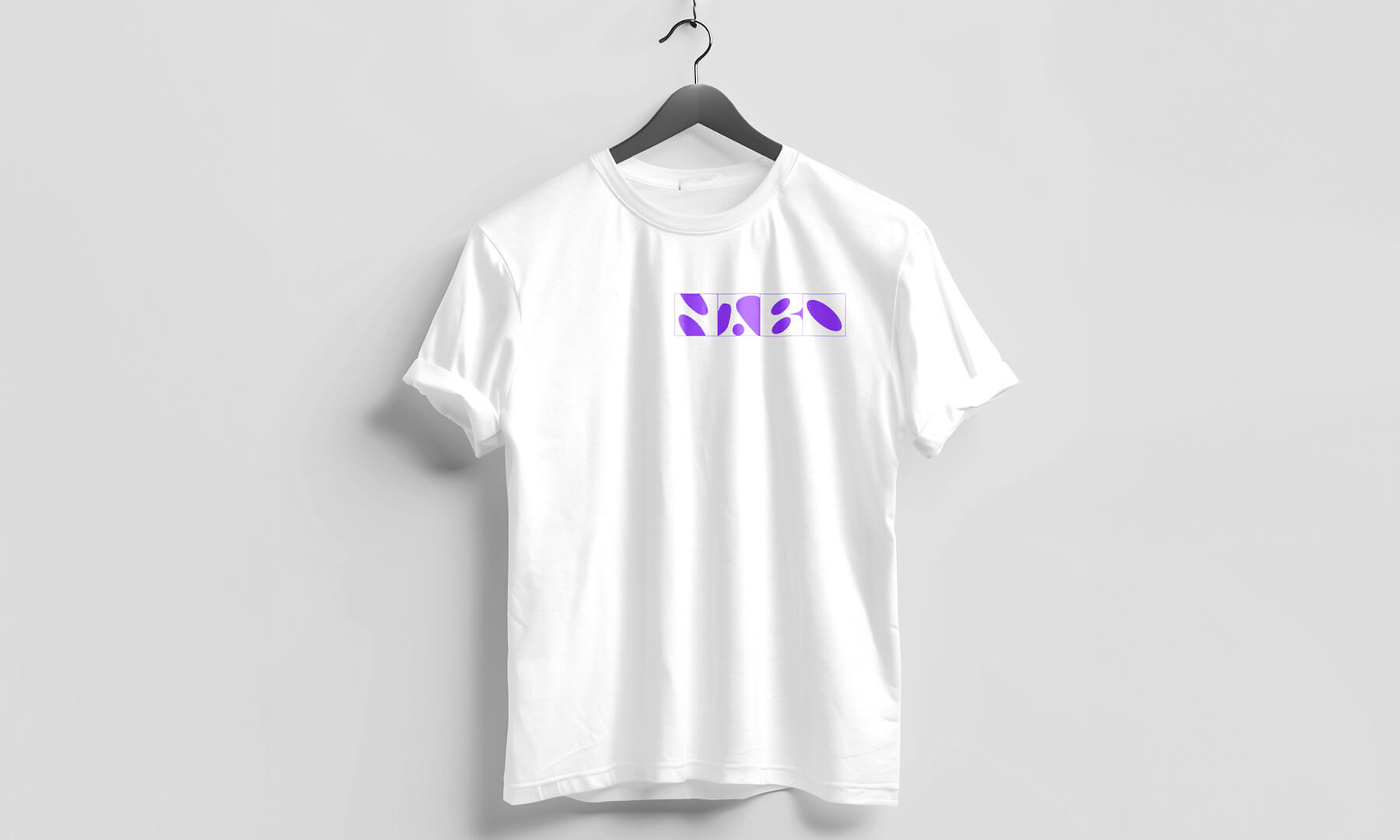
- Merchandising
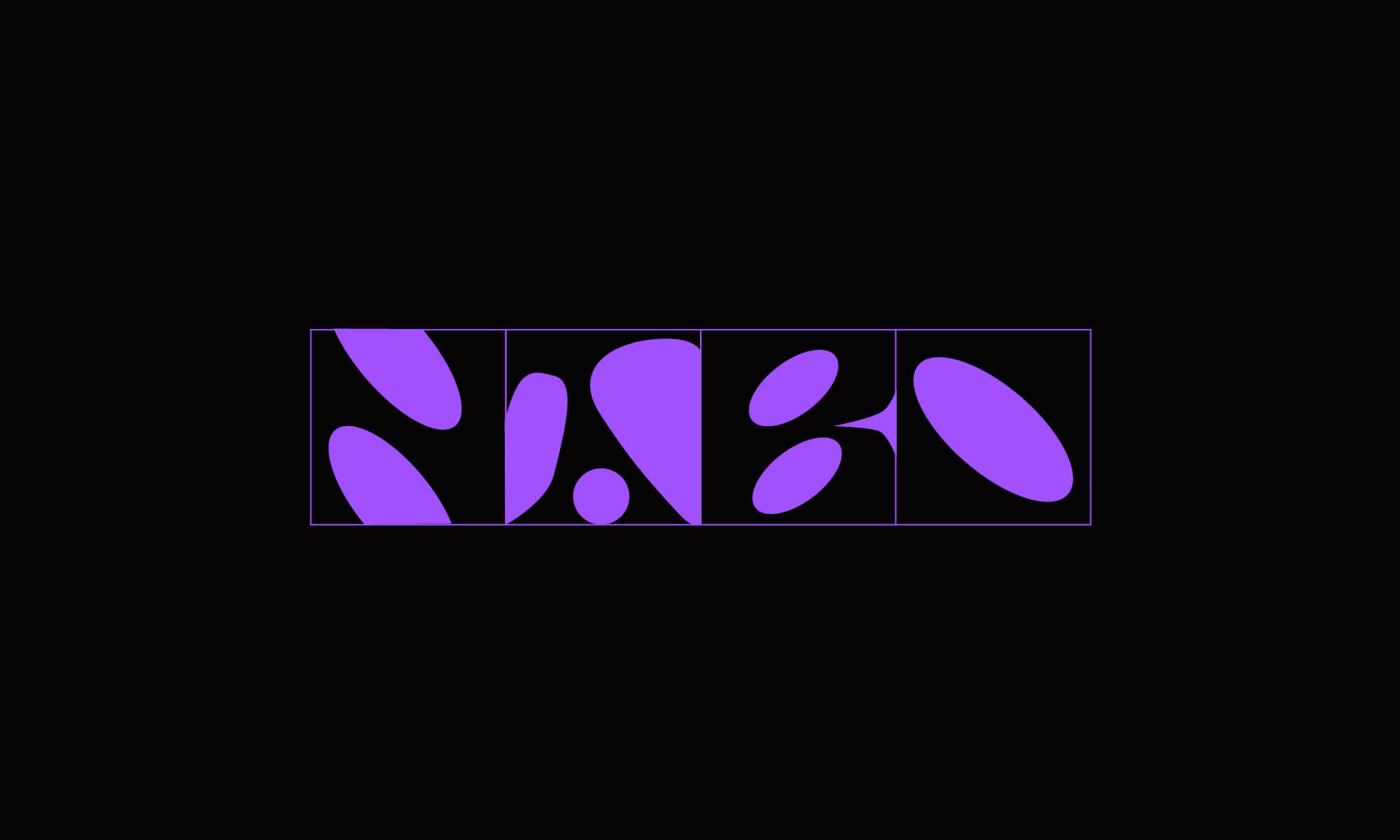
This project is a rebrand of the current NABO logo, an Independent publisher focused on photography books, and experimentation. It was also asked of us to propose a communication strategy. My goal was to avoid a more obvious and predictable approach. Instead of developing a graphic solution based on the abbreviated name and a directly associated with the vegetable, I chose to base my design on a font that makes use of the negative space within each letter, and that is how this logo came about.